
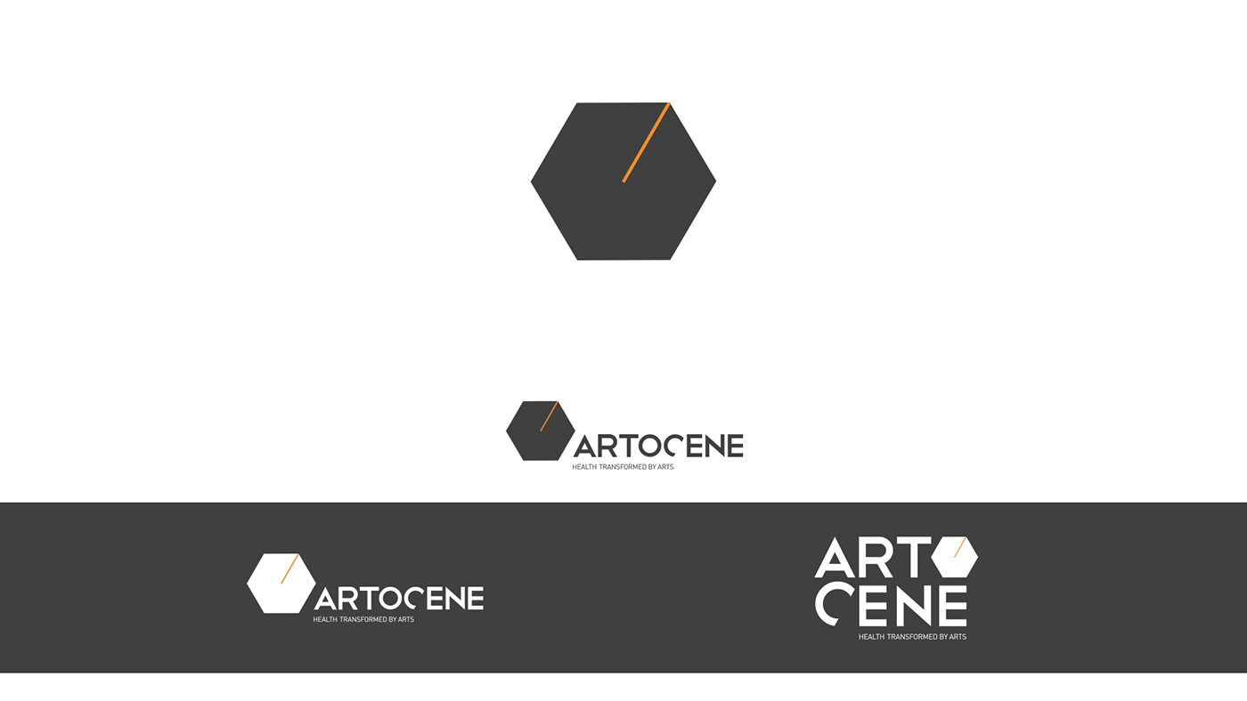
Visual Identity we did for Artocene association based in London. Artocene is a unique and special project founded by MD Iva Fattorini that is meant to integrate art into health care. Hexagon represents DNA, vital part of our biology and health. The one orange line represents intervention of art into health care and that simple intervention changes the whole picture. We now have cube. It represents how art can change our health recovery drastically. Never underestimate the power of Art. We learned that being involved in this great project.
• • •
• • •
Vizualni identitet za udrugu Artocene iz Londona. Artocene je jedinstven i hvale vrijedan projekt pokrenut od strane dr. Ive Fattorini s ciljem integracije umjetnosti u zdravstvenu njegu. Heksagon predstavlja naš DNA, najvažniji dio našeg bića i zdravlja. Jedna narančasta linija predstavlja intervenciju umjetnosti u zdravstvo i kako jedna jednostavna intervencija mijenja kompletnu sliku. Crta sada vizualno od heksagona čini kocku. Nikada ne podcjenjujte utjecaj umjetnosti na vaše zdravlje. To je ono što smo definitivno naučili na ovom originalnom projektu.

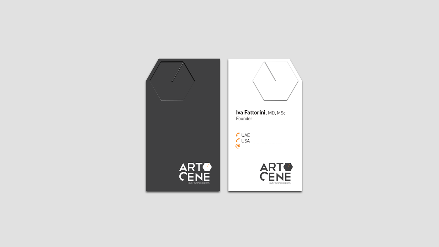
Adaptation of Artocene logotype for Mobile app with Art exercises for patients


